This is probably the single biggest problem with Etsy photos: the photos are just too damn dark. For example: 
Is that a scarf or...a ghostly mist of pure evil? It's so hard to tell with this lighting. This was a scarf I had made for a custom order long ago, so while this photo wasn't planned as an Etsy listing, this was the actual "after" shot I sent to the customer. Bad Kelli of yore.
"See the good quality? Nice even rows, pretty pattern, a decent length...and it blends in with the shadows! Perfect for any ninja in your life."
Nevertheless, dark photos happen to the best of sellers. So how do you fix it?
There are a couple methods I use for fixing up pictures. If you have Microsoft Office installed on your computer, chances are you also have the MS Office Picture Tool (try looking under the Office Tools folder, if you can't find it). This is a standard photo viewing and editing program which is actually pretty solid. Open up a picture with this program, then click the Edit Pictures button. A list of options will pop up on the right of which you'll choose "Brightness and Contrast." The new menu will display (depending on your version) Brightness, Contrast, and Midtones. In general, you should avoid the Brightness option, choosing to use Midtones instead. This will bring out a photo's highlights without fading the overall image.
If you would like to try a program with more flexibility and features, upload your picture to Picnik.com. Click on the Exposure button at the top. There you'll find a handy slide tool, which you can use to make the picture brighter. While this quick repair won't wow anybody, it certainly improves the quality and gives the customer a better idea of what they're buying: 
Like magic. However, keep in mind: this software is not God. It will not make your picture fabulous, nor will it get you laid. Your best bet is to put the initial work into making the picture a good one and just use this software as a supplemental tool.
One of the best tricks I have found is to create a light reflector, by using the dull side of aluminum foil and a piece of cardboard. Cheap, quick, and very handy.
Here is a good tutorial to show you how to make and use it:
Studio Quality Product Photography with a $12 Setup - by Handmadeology
By re-directing light without washing out the object, a potential customer can get a better look at the item:
Here are some other articles which may be helpful:
Cost-Less Macro Photography Light Box by PetervG on Instructables.com
Small Object Photography by Marlo Miyashiro on Meylah.com
Make Your Pictures Pop by Bomobob on Etsy.com
But if you'd rather just have a quick summary, here it is:
Never use your flash
Along those lines, remember it is much easier to correct dark photos than those with glares
When possible, use natural light
Try to avoid direct sunlight, as it can give you a harsh glare or wash out the object altogether
Rather, reflect the sunlight off of something else, even if it is white posterboard
Brighten photos afterward, using the exposure settings on a photo editing software.
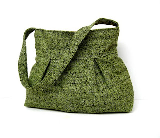
Remember: dark and brooding only works if you're a poet, a teenager, a vampire, or some combination of the three. Otherwise, opt for clear, bright, and shadowless:

Green Shoulder Bag by Marbled


1 comment:
Great Information Blog Post.I would like to share more stuff with you, related to the Discontinued Lenox China
Post a Comment