If you haven't been by my Etsy shop lately, you are about to miss out on an awesome deal. For a long time, I've wondered how to make my shop look more cohesive. I liked the variety, but at the same time, it was a little too chaotic with too many product lines.
My first step was to ditch the book thongs. Or rather, to move them to their own Etsy shop. I'm not really feeling them right now, but I don't want to quit them entirely. So there they sit until I decide whether to start promoting them...or to just kill them already.
My next step is actually happening right now. I thought about which items were making my shop look cluttered. Which items didn't have that "Bitter o'Clock" look about them. Which hats had been hanging around since before I developed my own style.
It was actually easy for me to spot them. They weren't quirky, strange, or random. They were just hats. Nice hats, sure. Well-made, okay. But just hats. So, I decided these were the ones that had to go.
To ring in 2012, I am discontinuing some of my older products. From now until Wednesday, January 11th, all items in the Clearance section have been marked at 50% off the normal price. Yes, this includes the custom orders. But this is first-come, first-served. I will not be re-listing anything.
On Thursday, January 12th, they will be marked down an additional 25%...by only for a few hours. By Friday, January 13th (wooooooooo), they'll be gone. Vanished into the ethers of Etsy. For-ev-er.
There you have it. Pop over to my Etsy shop to see if any of those hats tickle your fancy or anything else.


January 9, 2012
Bitter o'Clearance.
August 24, 2011
How to Make a Hat-Stand for Less Than Ten Bucks
I hear tutorials are popular on blogs. But I also hear that I don't really know how to make a tutorial. So instead, I will give this a tutorial title, but just show you this cool thing I made. My readers are smart: I'm certain they can figure the specific steps for themselves without proper instructions.
As a hat-maker, I've always struggled to find a good way to display hats for craft fairs. I started out by laying the hats flat on the table. That's a great way for people to not even see what you are selling.
Then I added some of those creepy, white Styrofoam heads into the mix:
Another time, my friend and I tried a stand-up lattice idea. It was a way to show off the hats vertically, but it seemed awfully busy:
Last year, I got the idea of going the shabby-chic route and displaying them on vintage candleholders:
Again, not a bad idea, but the table seemed just a little too shabby, with not enough chic.
A couple weeks, I began thinking again of ways to display those damn hats. I wanted something simple, something bright. Like me, you might say.
I went to Michaels for the materials, though Keene suggested Home Depot would probably be cheaper. Here's what I got:
Wooden "plaques" in various shapes - $2.00-$3.00 each
Acrylic paint in various colors - $.59 each
Wooden dowels - $.99 each
Wooden discs in large and small - $2.00-$3.00 each
Wood glue (already had, but is probably around $2.50)
First things first, I drilled a hole partway through the bottom of the discs, so it didn't actually penetrate the other side. I did this while holding the power drill in one hand and the disc in the other hand. This part scared Keene. But you know, some people just don't take enough risks when it comes to power drills and hands.
When all of the half-holes were drilled, I used what Keene insists is not a hacksaw to cut the dowels into varying heights between 9" to 24" tall. Then I wood-glued the drilled holes, and hammered the dowels in with a rubber mallet:
I also used a level to make sure the discs were level, because that would have been an embarrasing tutorial if they weren't.
Then it was time to paint:
By the by, if you're going to also buy paintbrushes from Michaels, don't go for the cheap ones unless you want little hairs stuck in your paint. I ended up using a clean kitchen sponge after realizing this.
After several coats of paint, the hat-stands were finished! Hooray!

May 26, 2011
How to Fail on Etsy: Clutter in the Background
I've become an Etsy photo snob over the last year, because one can't browse through Etsy without finding some cringingly, eyebrow-raisingly bad photos. The item itself could be beautiful and of high quality, but a bad photo makes it hard to know this.
You may wonder, what makes me think I'm an expert on product photos?
Well, I have eyes. It's true. And they are even good, strong eyes. (And stunning, I might add.) So when I see these photos, I rely on my good eyes to say, "Wowie, that is a really bad photo."
I am not a photographer. I like taking photos, but they are never going to be of hanging-on-living-room-walls quality. I'm okay with this. We can't all be professional photographers, but we can take decent product photos for Etsy.
Remember that bit about being a photo snob for the last year? Well, before that, I was the seller who gave more thought to the dirt under my fingernails than to the photos I listed online. Then I wondered why my awesome stuff never showed up on the coveted front page of Etsy.
What makes a bad product photo? Last month, it was bad lighting and shadows. Today, it's clutter.
Now, this doesn't necessarily mean actual clutter, like dishes on a kitchen counter or your kids' backpacks and jackets laying on the couch. More commonly, it's simply the visual clutter which is taking up space in your photo.
As a potential buyer, you try to focus on the hat. But then your gaze keeps drifting to the glowing light and dark vortex of a hallway in the background. You stop wondering how you'll look in the hat and start wondering if the person is in a cellar. Maybe she is trapped and being held for ransom?
I remember coming across a baby blanket for sale on Etsy. The workmanship appeared to be top-notch. However, I couldn't tell you anything else about the blanket, such as the color of the yarn or the design. But I could tell you about the bedroom in which it was displayed: from the hollow brass headboard and the box of Kleenex on the nightstand (hey! I have that same box design at home!) to the traditional country-style quilt on the bed.
You may be asking, "But if the room is clean, what does it matter?" There are two reasons why you should keep the background uncluttered: 1) it keeps the focus on the product, 2) simply put, it's more professional. Could you imagine browsing a catalog online and seeing the model standing in a bedroom with the blinds half-drawn, a cat walking behind her foot, and a cobweb hanging from the ceiling fan? Of course not. Professional product photos are created in controlled spaces, with the photographer considering any possible background clutter.
While we all know Etsy is a place to buy goods directly from the maker, buyers still want to know that they are dealing with professionals. There is nothing professional about, "Hey, this is the Kleenex I use to wipe snot from my nose while working on the hat which you'll later wear on your head." Or, "Hey, I don't make my bed and I just throw dirty clothes on the floor...but don't worry, I take great care of my products!"
(Don't worry...this photo didn't actually make it onto Etsy.)
So enough with the criticism, what can you do to declutter a shot? It can be as simple as posing your item in front of a blank, empty wall. The plain white background is really popular on Etsy because it won't detract from the product and because it produces a super clean shot. Nevertheless, I like bright, bold colors, so I use a ghettography prop: posterboard. I bought posterboard in several vibrant colors from an office supply store. Then I either prop the boards against something or pin them to the wall, depending on where I need them.
This is what a typical setup looks like:
My "photo studio" is on a desk in my bedroom, near a window where I can take advantage of the natural light. From afar, there is definitely clutter. But that is not what will be in the shot. Instead, the customer will only see something like this:

Nevertheless, the background doesn't have to be empty or a solid color to be uncluttered. Incorporating a pattern into the background can enhance a photo. For example, Etsy seller Bridal Brick Row uses a brick wall background in each photo:
Pixel Cloud uses a soft, sedate wallpaper to accent the shop's vibrant prints:
In closing, be mindful of the background, know and control what your customers will see, and make sure your product always remains the focus of the photo.
April 10, 2011
How to Fail on Etsy: Embrace Shadows
This is probably the single biggest problem with Etsy photos: the photos are just too damn dark. For example: 
Is that a scarf or...a ghostly mist of pure evil? It's so hard to tell with this lighting. This was a scarf I had made for a custom order long ago, so while this photo wasn't planned as an Etsy listing, this was the actual "after" shot I sent to the customer. Bad Kelli of yore.
"See the good quality? Nice even rows, pretty pattern, a decent length...and it blends in with the shadows! Perfect for any ninja in your life."
Nevertheless, dark photos happen to the best of sellers. So how do you fix it?
There are a couple methods I use for fixing up pictures. If you have Microsoft Office installed on your computer, chances are you also have the MS Office Picture Tool (try looking under the Office Tools folder, if you can't find it). This is a standard photo viewing and editing program which is actually pretty solid. Open up a picture with this program, then click the Edit Pictures button. A list of options will pop up on the right of which you'll choose "Brightness and Contrast." The new menu will display (depending on your version) Brightness, Contrast, and Midtones. In general, you should avoid the Brightness option, choosing to use Midtones instead. This will bring out a photo's highlights without fading the overall image.
If you would like to try a program with more flexibility and features, upload your picture to Picnik.com. Click on the Exposure button at the top. There you'll find a handy slide tool, which you can use to make the picture brighter. While this quick repair won't wow anybody, it certainly improves the quality and gives the customer a better idea of what they're buying: 
Like magic. However, keep in mind: this software is not God. It will not make your picture fabulous, nor will it get you laid. Your best bet is to put the initial work into making the picture a good one and just use this software as a supplemental tool.
One of the best tricks I have found is to create a light reflector, by using the dull side of aluminum foil and a piece of cardboard. Cheap, quick, and very handy.
Here is a good tutorial to show you how to make and use it:
Studio Quality Product Photography with a $12 Setup - by Handmadeology
By re-directing light without washing out the object, a potential customer can get a better look at the item:
Here are some other articles which may be helpful:
Cost-Less Macro Photography Light Box by PetervG on Instructables.com
Small Object Photography by Marlo Miyashiro on Meylah.com
Make Your Pictures Pop by Bomobob on Etsy.com
But if you'd rather just have a quick summary, here it is:
Never use your flash
Along those lines, remember it is much easier to correct dark photos than those with glares
When possible, use natural light
Try to avoid direct sunlight, as it can give you a harsh glare or wash out the object altogether
Rather, reflect the sunlight off of something else, even if it is white posterboard
Brighten photos afterward, using the exposure settings on a photo editing software.
Remember: dark and brooding only works if you're a poet, a teenager, a vampire, or some combination of the three. Otherwise, opt for clear, bright, and shadowless:
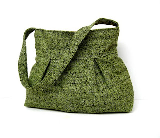
Green Shoulder Bag by Marbled
December 17, 2010
Crocheting Hippo-Hatamus
You want to know how I get my creative juices a-flowing? No, don't worry, it's nothing that will make you feel weird later for knowing. My thought process goes something like this: "I have a craft fair tomorrow. I've been selling a lot of frog hats lately. I should make another animal hat for tomorrow. What is another kind of ugly animal that you don't often see as a hat? Ooh, a hippo, and I even have a bunch of purple yarn!"
That's all.
I started by making just a basic beanie, then added the details. For the snout, I crocheted a large, triangular piece, then stuffed and whip-stitched it on. To give the appearance of separate "cheeks," I simply cinched the middle of the bottom row. Then some triangular ears, a couple nostril flaps. When I got to the eyes, I looked at many photos of real hippos, to get an idea of how I would design them. What I noticed is that hippos have fairly ugly eyes, simultaneously saggy and bulgy.
True to life, I made the eyes dark, bulging in their saggy sockets. Keene said, "I think it would be more relatable if you added some white to the eyes." I said, "But you don't really see the whites on real hippos." He said, "But it would be more relatable." I said, "Who relates to a hippo anyways?" I kept it ugly, its eyes dead and full of despair.
(Ignore the line running down the side of the snout. It was a failed experiment which was later axed.)
Unfortunately, in addition to being an ugly, unrelatable animal, the hat is also hugely un-photogenic. No matter how many times I tried, no matter the angle, lighting, or model, the hat just looked weird and shapeless.

But on the bright side, this hat could totally chomp you in half.
September 17, 2010
The Next-Day Challenge: Purple Mountain Lion Hat
Yesterday, my friend Anne, emailed me, asking if I could create an "emergency hat". Her coworker's birthday was the following day (that would make it today, for those uncaffeinated readers out there). Would I be able to pump out a hat in time? Or would I fail, thereby ruining my friend's coworker's birthday forever? (What? It's my blog...if I want to have an inflated sense of my own importance in the world, that is my prerogative.)
Sounded easy enough, but this was no ordinary hat. Anne had recently read my post about the Frogger hat and wondered if I could make a similar hat, but with a mountain lion. A purple mountain lion, at that. Her coworker had attended Kansas State University, for which the mascot is this:
Okay, so the KSU mascot is actually a wildcat and not a mountain lion. But you know what you get when you google "wildcat"? A whole bunch of cute, little domestic kittehs. No, no. We were going with brawn.
I got started on the hat later that night, while watching documentaries about the Donner Party and the Dust Bowl of the '30s. By the by, have you ever gone to PBS.org? There are lots of interesting videos online, which you can watch for free.
Anyhow, while I finished the major components of the hat, I was far from satisfied with the eyes, ears, and "snout". So, the next morning, I tore out yarn, re-did them, tore out more yarn, re-did them. After a bit of tweaking to make it look more realistic (yes, like a real purple mountain lion would look), I was satisfied with the final product (ignore the wacky lighting):
Doing a quick "would I wear this?" test, a pertinent part of the hat-making process:
It passed, so I delivered it to Anne. Within the hour, I heard back that the birthday girl loved the hat. Huzzah!
Happy birthday to Kristen! And thank you for being a good sport and letting me post your picture on this questionable blog:
(And thank you to Anne, for giving me something interesting to blog about, since I've been so boring this week. Well, unless readers want to hear about the riveting Plants vs. Zombies tournament going on at home. Neither do I.)


