May 26, 2011

How to Fail on Etsy: Clutter in the Background

I've become an Etsy photo snob over the last year, because one can't browse through Etsy without finding some cringingly, eyebrow-raisingly bad photos. The item itself could be beautiful and of high quality, but a bad photo makes it hard to know this.

You may wonder, what makes me think I'm an expert on product photos?

Well, I have eyes. It's true. And they are even good, strong eyes. (And stunning, I might add.) So when I see these photos, I rely on my good eyes to say, "Wowie, that is a really bad photo."

I am not a photographer. I like taking photos, but they are never going to be of hanging-on-living-room-walls quality. I'm okay with this. We can't all be professional photographers, but we can take decent product photos for Etsy.

Remember that bit about being a photo snob for the last year? Well, before that, I was the seller who gave more thought to the dirt under my fingernails than to the photos I listed online. Then I wondered why my awesome stuff never showed up on the coveted front page of Etsy.

What makes a bad product photo? Last month, it was bad lighting and shadows. Today, it's clutter.

Now, this doesn't necessarily mean actual clutter, like dishes on a kitchen counter or your kids' backpacks and jackets laying on the couch. More commonly, it's simply the visual clutter which is taking up space in your photo.

As a potential buyer, you try to focus on the hat. But then your gaze keeps drifting to the glowing light and dark vortex of a hallway in the background. You stop wondering how you'll look in the hat and start wondering if the person is in a cellar. Maybe she is trapped and being held for ransom?


I remember coming across a baby blanket for sale on Etsy. The workmanship appeared to be top-notch. However, I couldn't tell you anything else about the blanket, such as the color of the yarn or the design. But I could tell you about the bedroom in which it was displayed: from the hollow brass headboard and the box of Kleenex on the nightstand (hey! I have that same box design at home!) to the traditional country-style quilt on the bed.

You may be asking, "But if the room is clean, what does it matter?" There are two reasons why you should keep the background uncluttered: 1) it keeps the focus on the product, 2) simply put, it's more professional. Could you imagine browsing a catalog online and seeing the model standing in a bedroom with the blinds half-drawn, a cat walking behind her foot, and a cobweb hanging from the ceiling fan? Of course not. Professional product photos are created in controlled spaces, with the photographer considering any possible background clutter.

While we all know Etsy is a place to buy goods directly from the maker, buyers still want to know that they are dealing with professionals. There is nothing professional about, "Hey, this is the Kleenex I use to wipe snot from my nose while working on the hat which you'll later wear on your head." Or, "Hey, I don't make my bed and I just throw dirty clothes on the floor...but don't worry, I take great care of my products!"


(Don't worry...this photo didn't actually make it onto Etsy.)

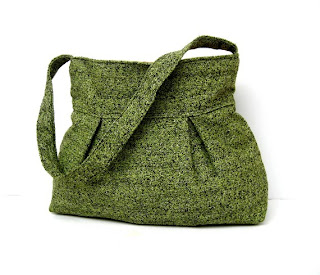
So enough with the criticism, what can you do to declutter a shot? It can be as simple as posing your item in front of a blank, empty wall. The plain white background is really popular on Etsy because it won't detract from the product and because it produces a super clean shot. Nevertheless, I like bright, bold colors, so I use a ghettography prop: posterboard. I bought posterboard in several vibrant colors from an office supply store. Then I either prop the boards against something or pin them to the wall, depending on where I need them.

This is what a typical setup looks like:


My "photo studio" is on a desk in my bedroom, near a window where I can take advantage of the natural light. From afar, there is definitely clutter. But that is not what will be in the shot. Instead, the customer will only see something like this:


Nevertheless, the background doesn't have to be empty or a solid color to be uncluttered. Incorporating a pattern into the background can enhance a photo. For example, Etsy seller Bridal Brick Row uses a brick wall background in each photo:


Pixel Cloud uses a soft, sedate wallpaper to accent the shop's vibrant prints:


In closing, be mindful of the background, know and control what your customers will see, and make sure your product always remains the focus of the photo.

April 10, 2011

How to Fail on Etsy: Embrace Shadows

This is probably the single biggest problem with Etsy photos: the photos are just too damn dark. For example:


Is that a scarf or...a ghostly mist of pure evil? It's so hard to tell with this lighting. This was a scarf I had made for a custom order long ago, so while this photo wasn't planned as an Etsy listing, this was the actual "after" shot I sent to the customer. Bad Kelli of yore.

"See the good quality? Nice even rows, pretty pattern, a decent length...and it blends in with the shadows! Perfect for any ninja in your life."

Nevertheless, dark photos happen to the best of sellers. So how do you fix it?

There are a couple methods I use for fixing up pictures. If you have Microsoft Office installed on your computer, chances are you also have the MS Office Picture Tool (try looking under the Office Tools folder, if you can't find it). This is a standard photo viewing and editing program which is actually pretty solid. Open up a picture with this program, then click the Edit Pictures button. A list of options will pop up on the right of which you'll choose "Brightness and Contrast." The new menu will display (depending on your version) Brightness, Contrast, and Midtones. In general, you should avoid the Brightness option, choosing to use Midtones instead. This will bring out a photo's highlights without fading the overall image.

If you would like to try a program with more flexibility and features, upload your picture to Picnik.com. Click on the Exposure button at the top. There you'll find a handy slide tool, which you can use to make the picture brighter. While this quick repair won't wow anybody, it certainly improves the quality and gives the customer a better idea of what they're buying:


Like magic. However, keep in mind: this software is not God. It will not make your picture fabulous, nor will it get you laid. Your best bet is to put the initial work into making the picture a good one and just use this software as a supplemental tool.

One of the best tricks I have found is to create a light reflector, by using the dull side of aluminum foil and a piece of cardboard. Cheap, quick, and very handy.

Here is a good tutorial to show you how to make and use it:

Studio Quality Product Photography with a $12 Setup - by Handmadeology

By re-directing light without washing out the object, a potential customer can get a better look at the item:


Here are some other articles which may be helpful:

Cost-Less Macro Photography Light Box by PetervG on Instructables.com

Small Object Photography by Marlo Miyashiro on Meylah.com

Make Your Pictures Pop by Bomobob on Etsy.com

But if you'd rather just have a quick summary, here it is:

Never use your flash

Along those lines, remember it is much easier to correct dark photos than those with glares

When possible, use natural light

Try to avoid direct sunlight, as it can give you a harsh glare or wash out the object altogether

Rather, reflect the sunlight off of something else, even if it is white posterboard

Brighten photos afterward, using the exposure settings on a photo editing software.


Remember: dark and brooding only works if you're a poet, a teenager, a vampire, or some combination of the three. Otherwise, opt for clear, bright, and shadowless:


Green Shoulder Bag by Marbled

December 17, 2010

Crocheting Hippo-Hatamus

You want to know how I get my creative juices a-flowing? No, don't worry, it's nothing that will make you feel weird later for knowing. My thought process goes something like this: "I have a craft fair tomorrow. I've been selling a lot of frog hats lately. I should make another animal hat for tomorrow. What is another kind of ugly animal that you don't often see as a hat? Ooh, a hippo, and I even have a bunch of purple yarn!"

That's all.

I started by making just a basic beanie, then added the details. For the snout, I crocheted a large, triangular piece, then stuffed and whip-stitched it on. To give the appearance of separate "cheeks," I simply cinched the middle of the bottom row. Then some triangular ears, a couple nostril flaps. When I got to the eyes, I looked at many photos of real hippos, to get an idea of how I would design them. What I noticed is that hippos have fairly ugly eyes, simultaneously saggy and bulgy.


True to life, I made the eyes dark, bulging in their saggy sockets. Keene said, "I think it would be more relatable if you added some white to the eyes." I said, "But you don't really see the whites on real hippos." He said, "But it would be more relatable." I said, "Who relates to a hippo anyways?" I kept it ugly, its eyes dead and full of despair.


(Ignore the line running down the side of the snout. It was a failed experiment which was later axed.)


Unfortunately, in addition to being an ugly, unrelatable animal, the hat is also hugely un-photogenic. No matter how many times I tried, no matter the angle, lighting, or model, the hat just looked weird and shapeless.


But on the bright side, this hat could totally chomp you in half.

November 30, 2010

At the Spa

Okay, we didn't actually take any pics while at the spa. So here are pics of us at Beau Jo's Pizza:


As Kortney said, "Keene's nose zit was not welcome in this picture":


Heeeeeey!

November 25, 2010

That kid is snarky

Aye aye aye. Kayden. It's really hard to get after him about being snarky when I'm too busy laughing behind my hand.

So, we were all in the car last night, on our way to take Kayden to his dad's house. Maia was eating (fast food, since we were en route).

Several times, I heard Kayden telling her to close her mouth while she eats (she is quite a loud eater). She continued to eat with her mouth open.

Finally, Keene said something like, "Well, Kayden, you have to give her a break if she occasionally opens her mouth to breathe or something..."

Without missing a beat, he said, "Isn't that what a nose is for?"

November 24, 2010

Hello? Is it me you're looking for?

Last night, I was watching a movie on my computer while crocheting. In the living room, Keene was typing away on his computer.

Suddenly, I get a call. I look at the ID and it's Keene. I look up and he's still typing. I hold up my phone and say, "Are you calling me?"

He pulls his phone from his pocket, looks at it, and says, "Oh, I guess I was."

I reply, "Apparently, something in your pocket really wants to talk to me."

In my mind, I imagine this to be the conversation:

Kelli: Hello?
Keene's pocket: ::heavy breathing::

November 1, 2010

The Significance of Markings on Lenox China

(Reposted from Lenox-China.net)

It is believed that the first china markings were done by Meissen Royal Manufactory in the eighteenth century. The king of Saxony, Augustus Rex (also known as Augustus the Strong), commissioned the first production of hard-paste porcelain in Europe. Meissen painted an “AR” on the pieces, in honor of the king. Shortly thereafter, the company began using the famous crossed swords mark, which is still in use today.

Markings are often located on the bottom of a piece, and usually include (depending on the age of the item) a pattern name, a product number, the year of its creation, company name, retailer, and/or brand name. To make life even more confusing for the identifier, sometimes a piece will have both the name of the factory which produced the piece, as well as another mark signifying the decorator.

There are clues to identifying the age of a piece right away, based on the emerging laws and standards of certain time periods. For example, if an English piece has the name of the pattern printed, it was created after 1810. If the word “Royal” appears, the piece was made after 1850. If you see the word (or associated abbreviations) “Limited,” the piece was created after 1861, while the words “Trade Mark” tell you the piece was created after the Act of 1862. Similarly, the letters “R N” signify a date of creation after 1883. If the words, “bone china” are included, the piece was made in the twentieth century (or later).

Lenox has made it fairly easy to identify the age of its china. The first pieces were stamped with “Ceramic Art Company” or “Lenox Belleek,” depending on the style. In 1906, the stamp was changed to a green wreath surrounding the letter “L,” with the name Lenox below it. (Nevertheless, even if the company name is missing, it is still authentic if it has the wreath logo.) In 1930, the phrase “Made in U.S.A.” was included. This stamp remained the standard backstamp until 1953, when the wreath’s color was changed to gold.

Another way of identifying Lenox china is by the date code. If there is not a pattern name, look for a series of letters and numbers either on the bottom or on the rim of a piece. The first set of numbers before the slash describes the piece’s shape. Next, you will find a letter and a number (and sometimes, a second letter), which makes up the date code. If you find a date code but no pattern name, the piece was likely created before 1950—the year when Lenox quit using the date code system. After the date code, you should see a string of letters which correspond to a piece’s pattern colors.

With this gathered information, you can look up the maker, pattern, year, and/or value of your piece on the Lenox website, in an encyclopedia of china marks, through a replacement company, or by taking the piece to an appraiser or antique shop.